"I tried to make this kind of a TSA-style scale of worry, where red is really, really bad, and blue is really good. There is no blue on these slides, just so you know."
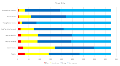
This is Christina Richey at 13 minutes and 54 seconds into her Masursky Award presentation (video here). Here's the slide she is referring to:
It's of course true that there is no blue on the slides. But it seems to me that that's because she chose not to chart the responses that would have had to be colored blue. In fact, the top end of her graph, which stops at 350, is completely arbitrary, failing to plot 76 "no response" answers that would have put the rest into perspective. Consider this alternative chart of the same data that I made:
I have used her color scheme for the data she did chart*, but it's clear what adding a little blue to the picture does for the overall impression. Indeed, Richey has chosen to color the response "rarely" in yellow, which is in line with her egregious misinterpretation (at 13:20 and forward) of her own data as showing that "people hear sexist remarks 82% of the time." This survey doesn't let us put a number on how often (X% "of the time") such language is heard. It counts how many people said they had heard it "rarely", "sometimes", and "often". And it found that only 6% of respondents fall into that last "red" category. I would have charted "no response" (I read: "never") and "rarely" in different shades of blue, "sometimes" in yellow, and "often" in red. That gives us the following picture:
Notice that I'm not here disagreeing with the data or with how it was collected (though I do have some issues with this as well). I'm simply presenting Richey's own data in a more informative way. Interestingly, it also then immediately becomes less "worrying" (to use Richey's characterization of her scale). One sometimes suspects the TSA's threat levels are constructed with an equally opportunist eye. But it's not good form. In fact, it's bad style. Just so you know.
__________
*Update: 02/11/16: As I mentioned back in February, when I first wrote about Richey's charts, I've also reordered the segments of each bar. Richey puts the most serious ("red") responses at the end of the bar, which is essentially a way of adding up all the non-zero responses. And giving them equal weight. The bar feels more troubling that way. In my chart, the "often"s give way to the "sometimes"s which give way to the "rarely's and then the "nevers".


No comments:
Post a Comment